Supporting a good cause is no longer enough as charities compete for donations and funding. Charities need to inspire love for both their brand and what they do in order to attract and keep donors.
Branding for charities should improve as they seek visibility and emotional connection to acquire greater funding and influence people.
Case Study: The Substance Abuse Foundation Inc.
Client: Registered charity, The Substance Abuse Foundation Inc. and its two residential facilities, Verdun House and Marina House
Project Categories: Brand strategy & architecture | User experience design | Website design & development | Online communications solutions
Duration: 3 months
Click here to visit the SAF Inc. online
Synopsis
The SAF Inc. is a registered charity, accredited by the EATA (European Association for the Treatment of Addictions). Established in 1996, the SAF Inc. manages two residential treatment centres in Barbados: Verdun House a male residential treatment facility and Marina House, a female residential treatment facility. Their purpose is to “fight the harmful impact of illicit drugs and alcohol on the shattered lives of citizens and their families in Barbados and the wider Caribbean”.
Challenge
Over the years, the SAF Inc. expanded, grew and transformed. Verdun House, the male treatment facility was the most popular brand, with its own website. The Substance Abuse Foundation rebranded some years later and began to improve in visibility. With their growth and improvements, funding for a female residential facility was acquired and the Marina House brand was also added. The SAF Inc. needed online representation for its various brands and activities.
Solutions
All three brands existed but three primary challenges were identified that led to a new solution:
- The existing Verdun House website was somewhat dated and no longer best represented the charity and the thrust of their visual brand communications
- There was a gap in online presence representing the SAF Inc. and Marina House.
- There was a gap in establishing and communicating the relationship between the three brands to the public.
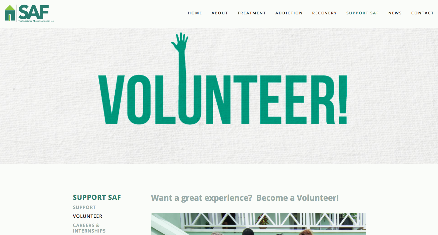
Through consultation with the team, an understanding of the organisation's functionalities and vision were gained in order to inform recommendations for the SAF Inc.'s brand architecture. A branded house approach most reflected the organisation's reality as all three brands held similar values, were united in core purpose and shared some coordinated activities. This positioning guided the recommendations for a single website through which all traffic would flow. Domain names for all brands were to be directed to the single site and the branded house positioning informed the development and treatment of graphic elements.
As the SAF Inc. has many users, the online experience was designed to guide categories of users to their most relevant content first, from the home page. Information was restructured and reorganised to provide a simpler user experience.
Through observational research and discussions, it was clear that the SAF Inc. was passionate about healing and that former clients and recovering addicts were equally enthused about the genuine transformation they achieved through the process, treatment and experience. Central to the online experience are comments of former clients, as if typed by the client himself/herself, highlighting the difference that the charity makes to the lives of individuals, families and communities. This element of motion is the focal point of many pages as the moving messages provide hope for families and individuals affected by the disease of addiction and proof of value for potential donors.
In addition to the website, an email marketing solution was also designed, developed and integrated with the website to help the SAF Inc. to connect with its stakeholders and drive traffic to the website.
Results
Once completed, the SAF Inc. gained the following
- All three brands represented online under one umbrella with seamless continuity from the former Verdun website to a new SAF Inc. website
- An affordable website and online solutions that met both their budgetary and practical needs; a solution that they could manage in-house with minimal external support (available as needed)
- Design and brand positioning that reflected their business vision and philosophy
- Promotion of their information, services, admissions process, programmes and publications in an easy to navigate format.
- Special provisions and on-brand iconography for key stakeholders to easily access their most relevant information
- A new website that met functional needs and was visually pleasing
- Positive reviews from the SAF Inc. Board of Directors, Executive Team, Administrative Support Team, key donors and benefactors, users in various categories and other stakeholders.


““This looks great. It’s refreshing. Kudos to you and the team for a job well done.””